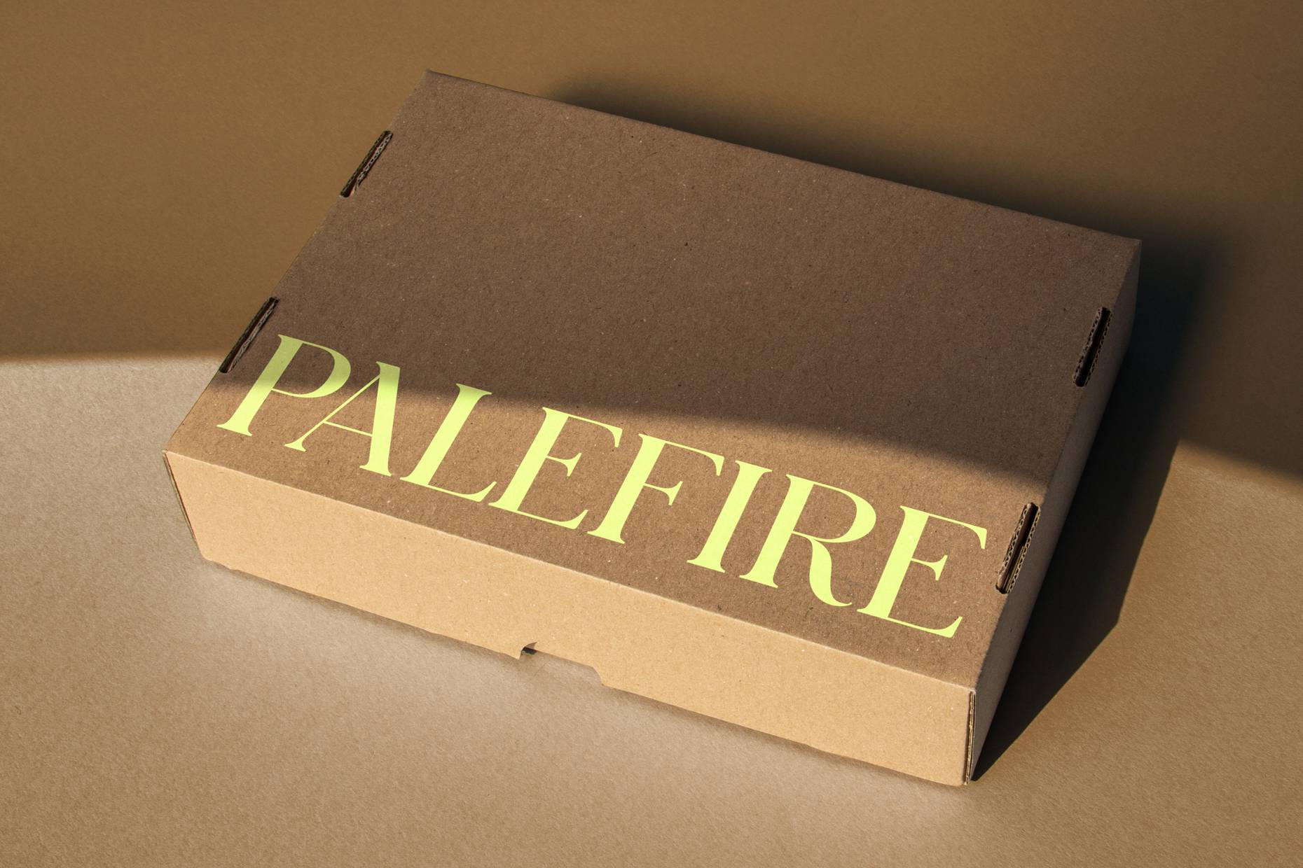
Palefire
A world in colour and light
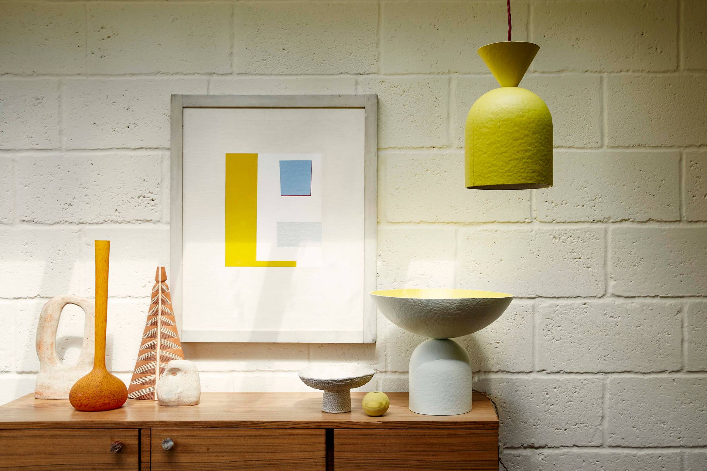
Palefire is a London-based lighting studio creating sculptural pieces from hand-painted paper pulp that blur the line between design and fine art. Defined by expressive forms, rich materiality and a playful use of colour, the studio creates work that challenges the trends dominating the market, offering an antidote through craftsmanship, character and artistic expression.
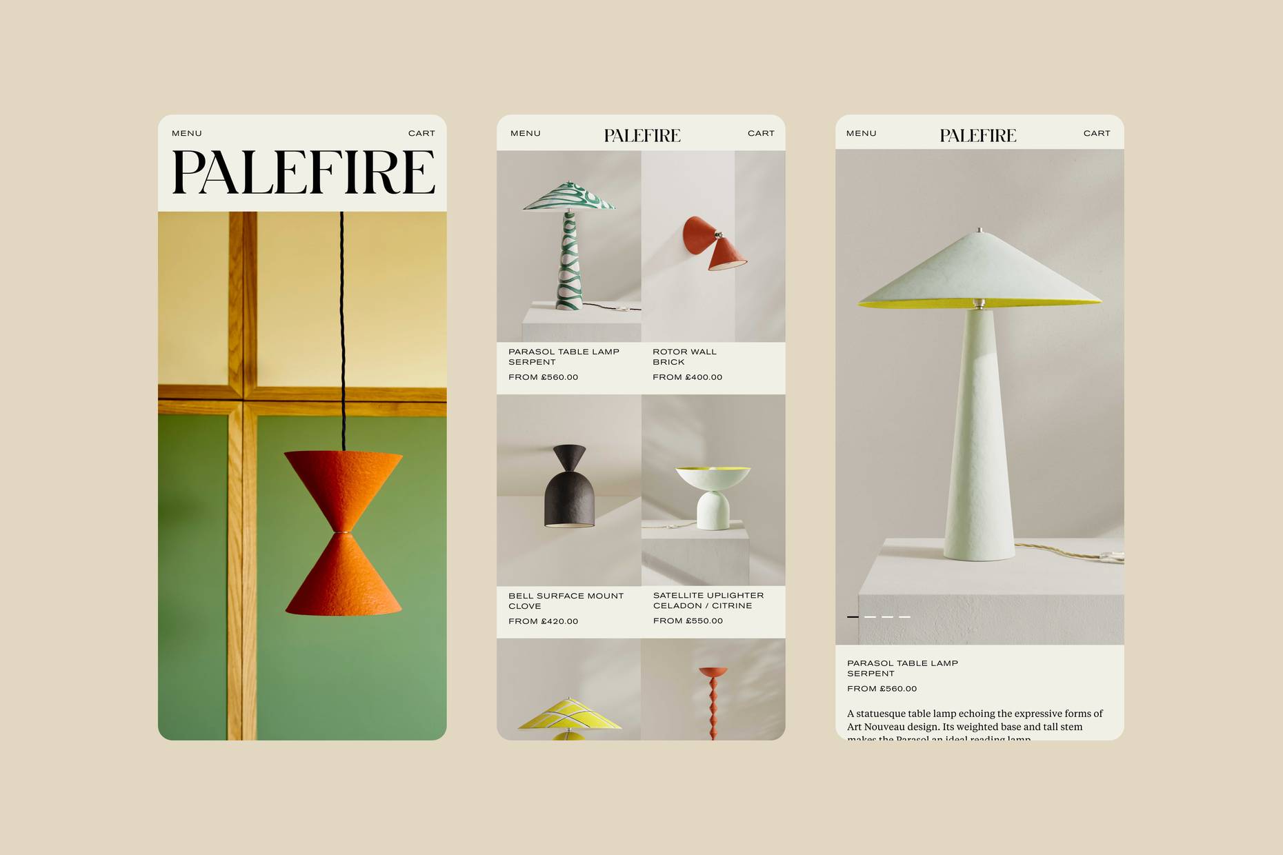
Working closely with the founders, a richer world around the brand was created, allowing its playful, painterly character to extend beyond the lighting itself. Through confident use of colour, generous scale and editorial pacing, the identity aims to create an experience that feels as expressive as their work.
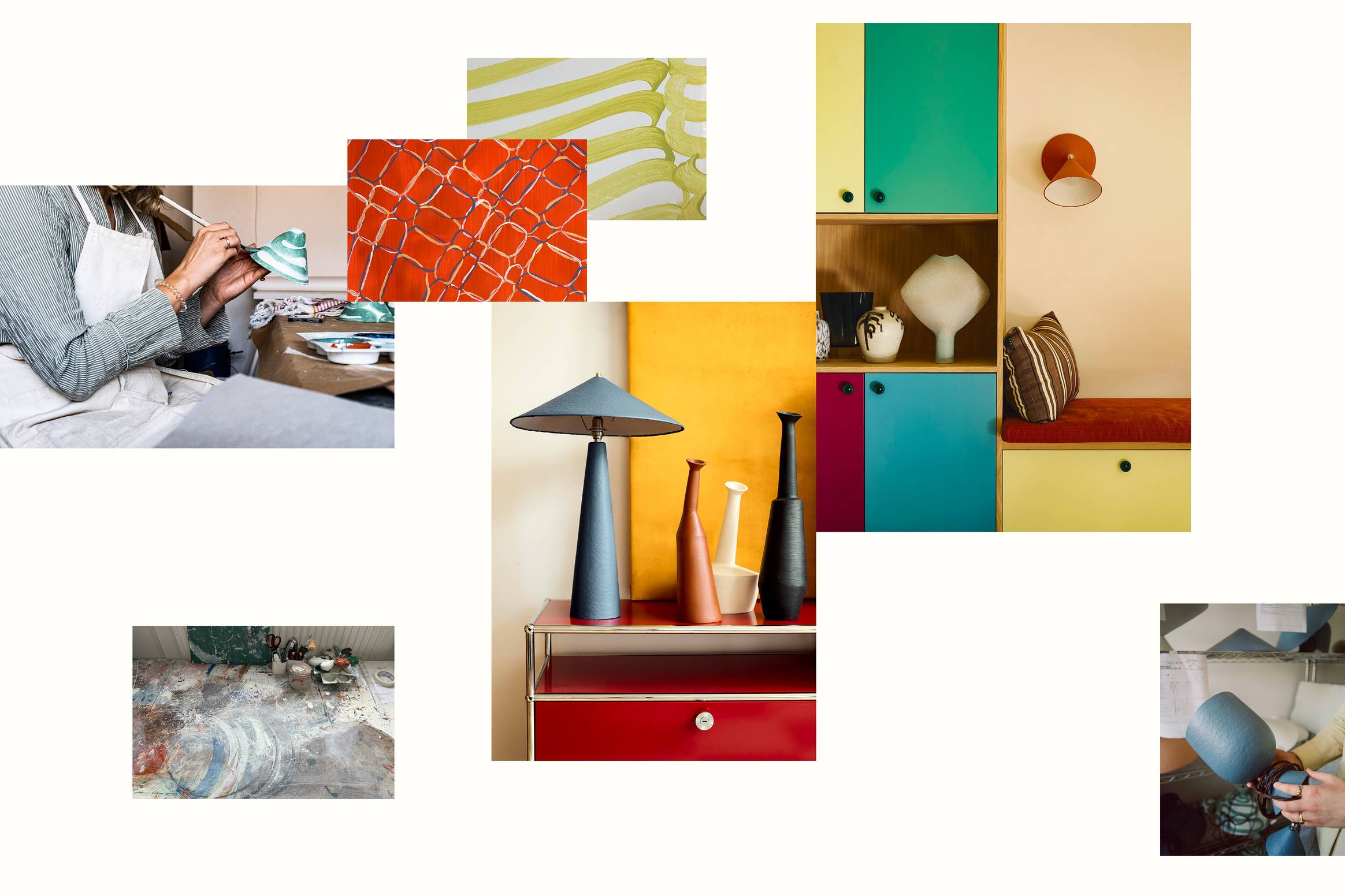
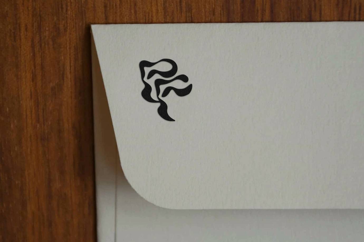
The monogram features throughout the identity, alternating between subtle detail and bold expression.
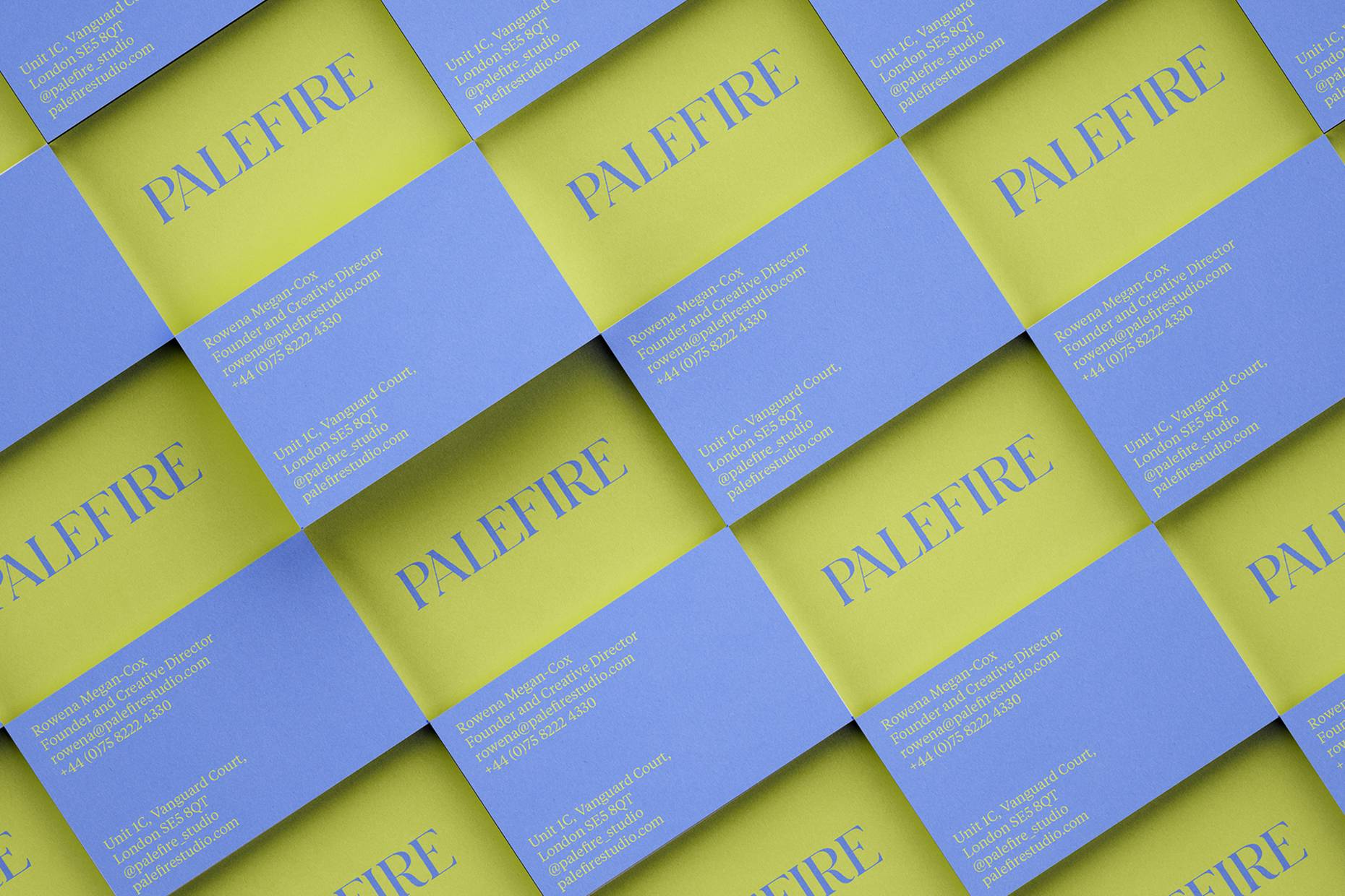
Inspired by Palefire’s love of colour, a palette of cool and warm tones invites unexpected combinations.

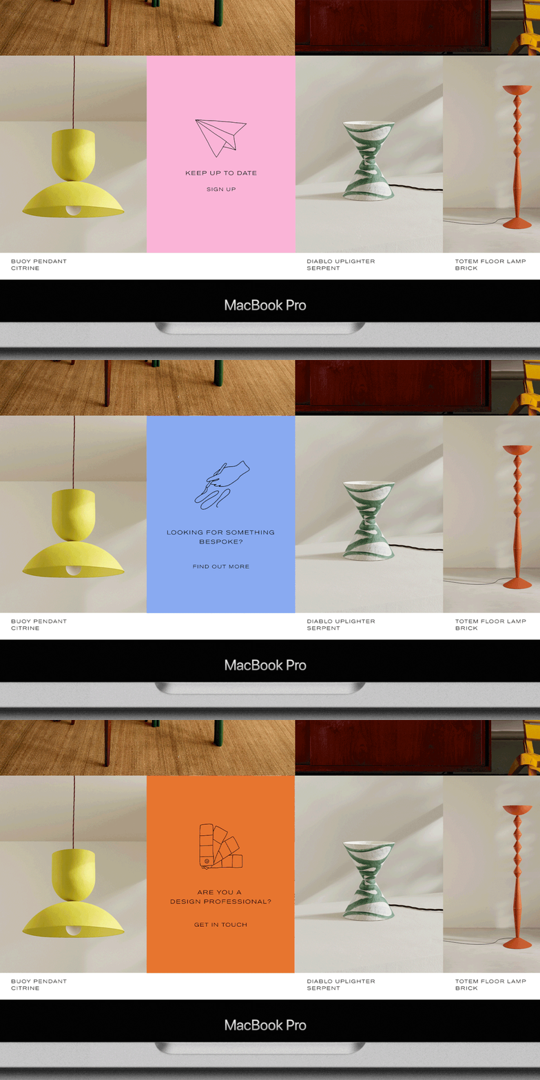
Hand-drawn icons highlight key moments across the website, from newsletter sign-up to professional services.
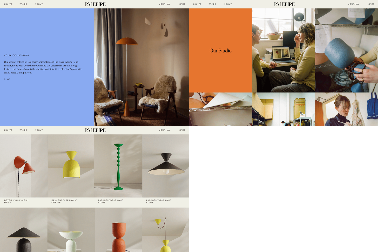
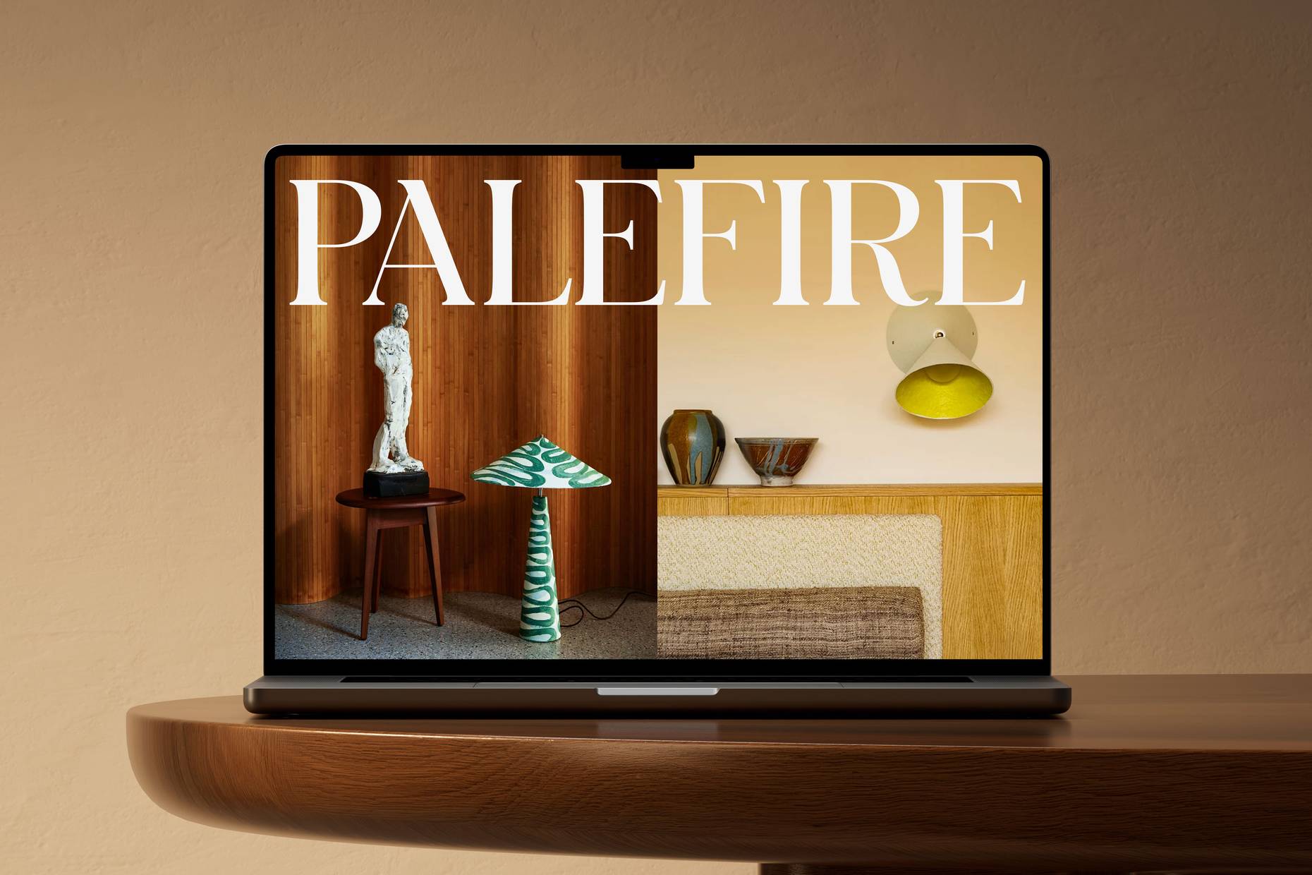
The visual system is built on a flexible grid of halves, thirds and quarters. By removing gutters, colour and imagery collide, creating compositions that feel rich and immersive.
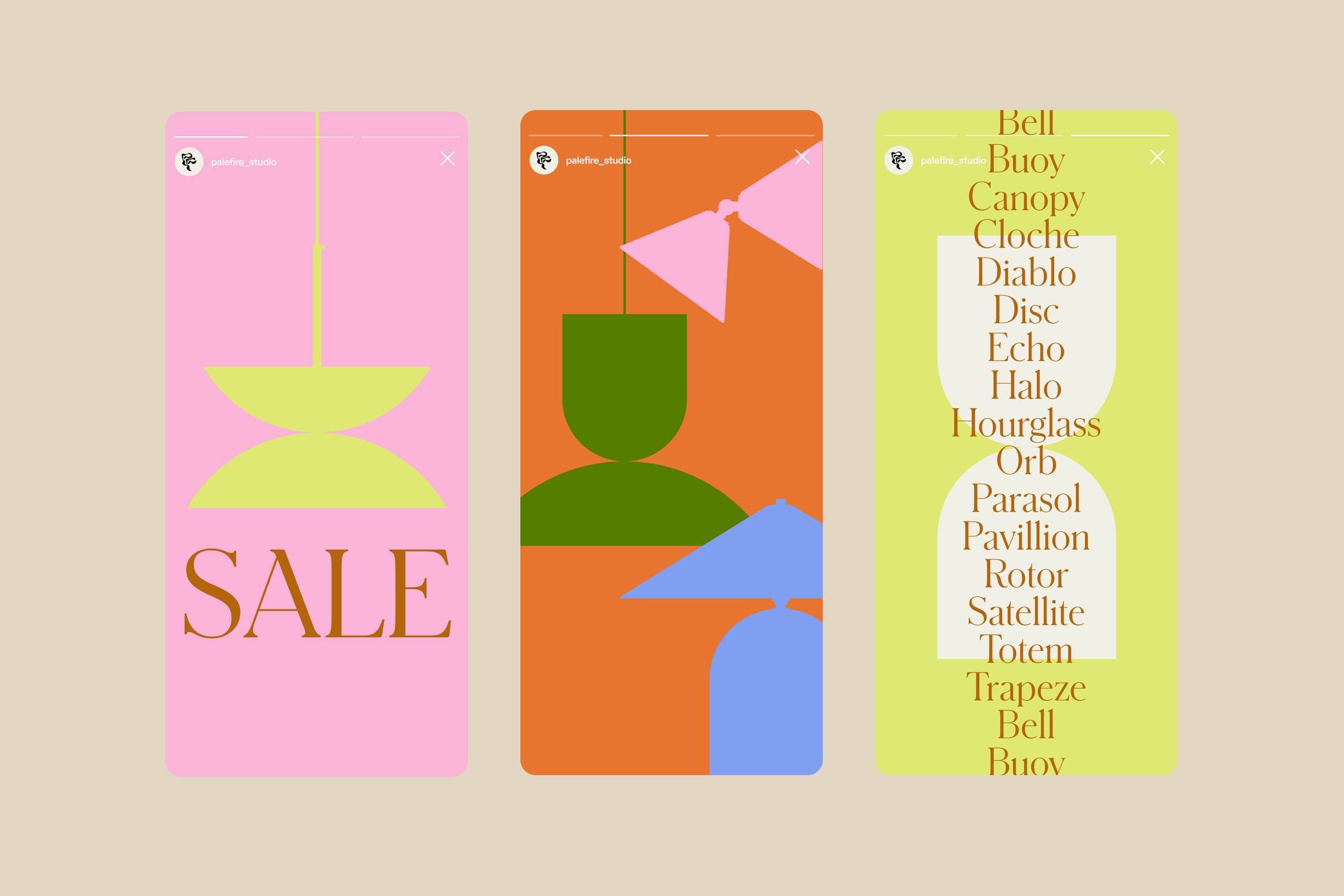
Below: Graphic shapes provide a secondary visual language for communicating sales and promotional moments.
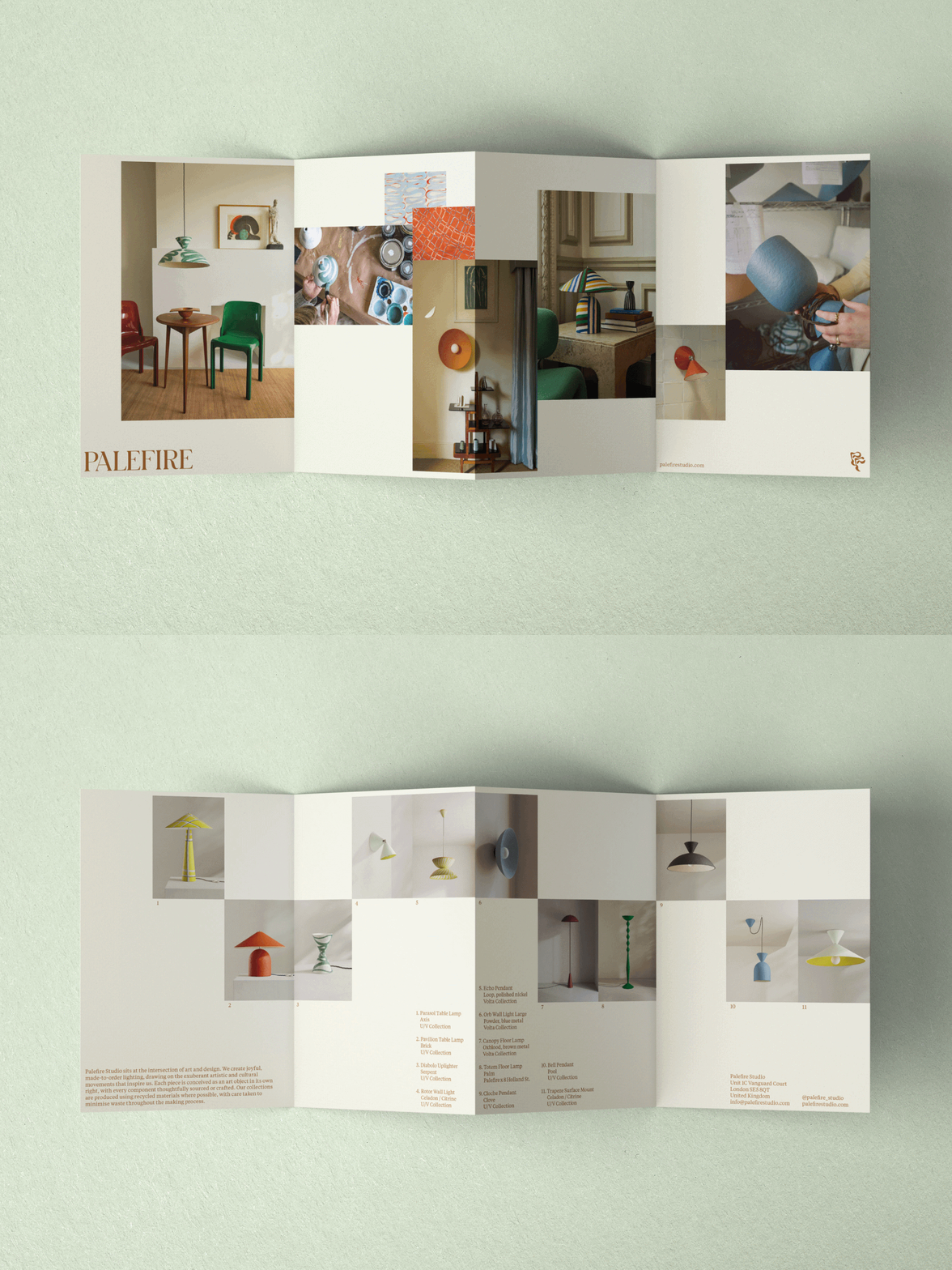
A printed concertina brings together lifestyle and studio photography, offering a glimpse into Palefire’s world, making process and bestselling pieces.
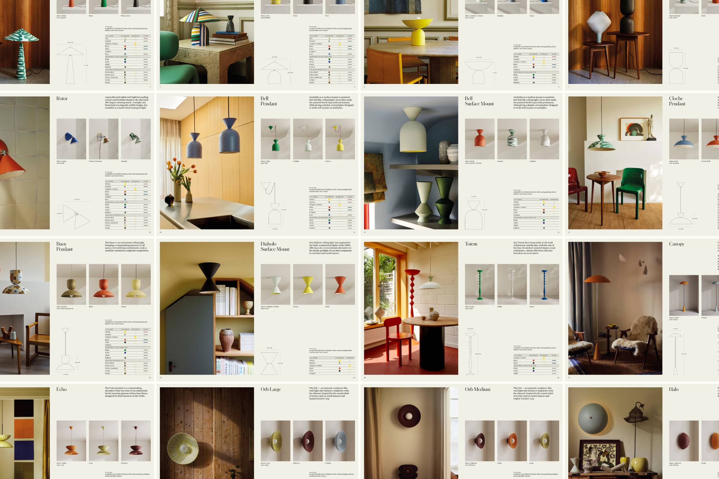
Designed to print as compact A5 booklets, these digital catalogues combine editorial layouts with clear illustrations and specification tables for every shade and cord combination.